Investment Portfolio Management & Financial Analytics Platform
A local-first Python platform that turns raw broker statement exports into a queryable portfolio database — with interactive charts, benchmark comparison against MSCI World, and performance, risk and allocation analytics.
A broker app tells you a number — not the story behind it
Every broker app shows the same thing: today's portfolio value, green or red since yesterday. What it doesn't show is the story — when positions were actually bought, what each decision cost, how the portfolio grew against the money that was paid in, and the one question every retail investor should be asking constantly: would simply buying a world index have done better?
The raw material to answer all of that exists. Brokers export complete account statements — every deposit, every trade, every savings-plan execution. But the export is built for accountants, not analysis: a German-language CSV with free-text descriptions, European number formatting and no clean instrument identifiers, plus PDF statements on top.
So this project builds the missing layer: a Python platform that ingests raw broker exports, normalises them into a proper transaction database, enriches every position with market price history, and serves the whole thing through an interactive desktop app — from single-position deep-dives to portfolio-level performance, risk and allocation analytics.
Turning a messy bank export into a clean transaction ledger
The unglamorous truth of the project: most of the engineering lives in the import pipeline. The broker's CSV arrives with German dates ('06 Aug. 2021'), amounts like '434,01 €', duplicated free-text fragments in the description column, and the instrument hidden inside the prose — 'Ausführung Handel Direktkauf Kauf IE00B4L5Y983 ISHSIII-CORE MSCI WLD DLA …'.
The pipeline attacks that line by line: descriptions are de-duplicated and cleaned, ISINs are pulled out with a validated regex, German month names and number formats are normalised, and every trade is classified — buy, sell or savings-plan execution — from the transaction wording. An ISIN registry then resolves each instrument to a display name and an asset class (stock, ETF, crypto), so 'ISHSIII-CORE MSCI WLD DLA' becomes 'iShares Core MSCI World UCITS ETF, ETF'.
The output is what the rest of the platform actually runs on: a chronologically sorted, machine-readable ledger where every row is a dated, typed, classified transaction on a known instrument. Garbage in stops here.
A proper schema instead of a folder of CSVs
Once cleaned, transactions land in a local SQLite database rather than yet another CSV. The schema is small but deliberate: an instruments table (ISIN, name, asset class, ticker), a transactions table (date, instrument, action, amount, fees) and a price-history cache keyed by instrument and date. Every downstream feature — holdings, performance, risk — is a query, not a re-parse.
Imports are idempotent: re-running the pipeline on an updated statement export inserts only what's new, so the database can be refreshed monthly with one command without ever duplicating a trade. That single property is what turned the tool from a one-off script into something that has tracked a real portfolio continuously across years of statements.
SQLite was the right-sized choice: a single file next to the code, zero server administration, transactional safety for imports, and instant SQL access for any ad-hoc question a spreadsheet would have made painful.
From ISIN to price history — messier than it sounds
A transaction ledger alone can't value a portfolio; every instrument needs its market price history. The platform pulls that from Yahoo Finance — which introduces a classic European-investor problem: market data APIs speak ticker symbols, brokers speak ISINs, and the mapping between them is anything but 1:1. The same UCITS ETF trades on half a dozen exchanges under different symbols and currencies; a Dublin-listed world ETF might be 'IWDA.AS' in Amsterdam and something else entirely in Frankfurt.
The platform maintains an explicit ISIN-to-ticker resolution table, choosing for each instrument the listing whose currency and history best match the broker's execution prices — and flags any instrument it can't resolve rather than silently plotting the wrong asset. Downloaded histories go straight into the price cache, so repeated sessions and portfolio-wide computations don't hammer the API: a full refresh fetches only the days since the last one.
With prices attached, every position gains its full context: what it cost, what it's worth, and what happened in between.
A desktop app organised the way a portfolio actually is
The front end is a Tkinter desktop app with embedded Matplotlib charts. Navigation mirrors the mental model of the portfolio itself: a main menu splits the universe into stocks, ETFs and crypto (each behind its own tile), a category view lays out every held instrument as a clean button grid with the category's current value summed at the top, and selecting any instrument opens its full position view.
Theming is built in — light, dark and a high-contrast alternate palette, applied consistently across UI chrome and charts — and the whole interface is deliberately keyboard-light and mouse-fast: two clicks from launch to any position in the portfolio.
It's not a web dashboard on purpose. A local desktop app opens instantly, works offline on cached data, and — the deciding argument for financial data — never moves a byte of it anywhere.
Every decision, drawn on the chart it was made in
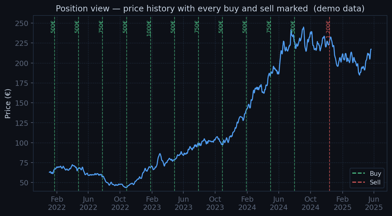
The core screen of the app: an instrument's full price history from first purchase to today, with every transaction drawn where it happened — green dashed lines for buys, red for sells, each annotated with the executed amount. Current holdings in the instrument are shown alongside.
Seeing decisions in context is quietly brutal and enormously educational. That 'obvious dip buy' turns out to have been halfway down a longer slide; the panic sell sits two weeks before the recovery; the monthly savings plan, unbothered, keeps stacking lines through all of it. No summary statistic delivers that lesson the way the annotated chart does.
The time axis got its own care: month ticks thin out automatically as the span grows, and year labels render once per January instead of cluttering every tick — small polish that keeps a four-year history readable at a glance.
Zoom and pan that feel like a trading terminal
Static charts die the moment you want to inspect one month inside a four-year history, so the charts are fully interactive, implemented directly on the Matplotlib event system: the scroll wheel zooms centred on the cursor — the point under the mouse stays fixed while the timeline stretches around it, exactly like professional charting tools — and right-click dragging pans the view in both axes, with pixel deltas converted to data coordinates so the chart tracks the mouse 1:1.
It's a small amount of code, but it changes the character of the tool: instead of generating a chart and looking at it, you navigate the history — scrub across years, dive into a single earnings week, jump back out.
One checkbox: would the index have beaten me?
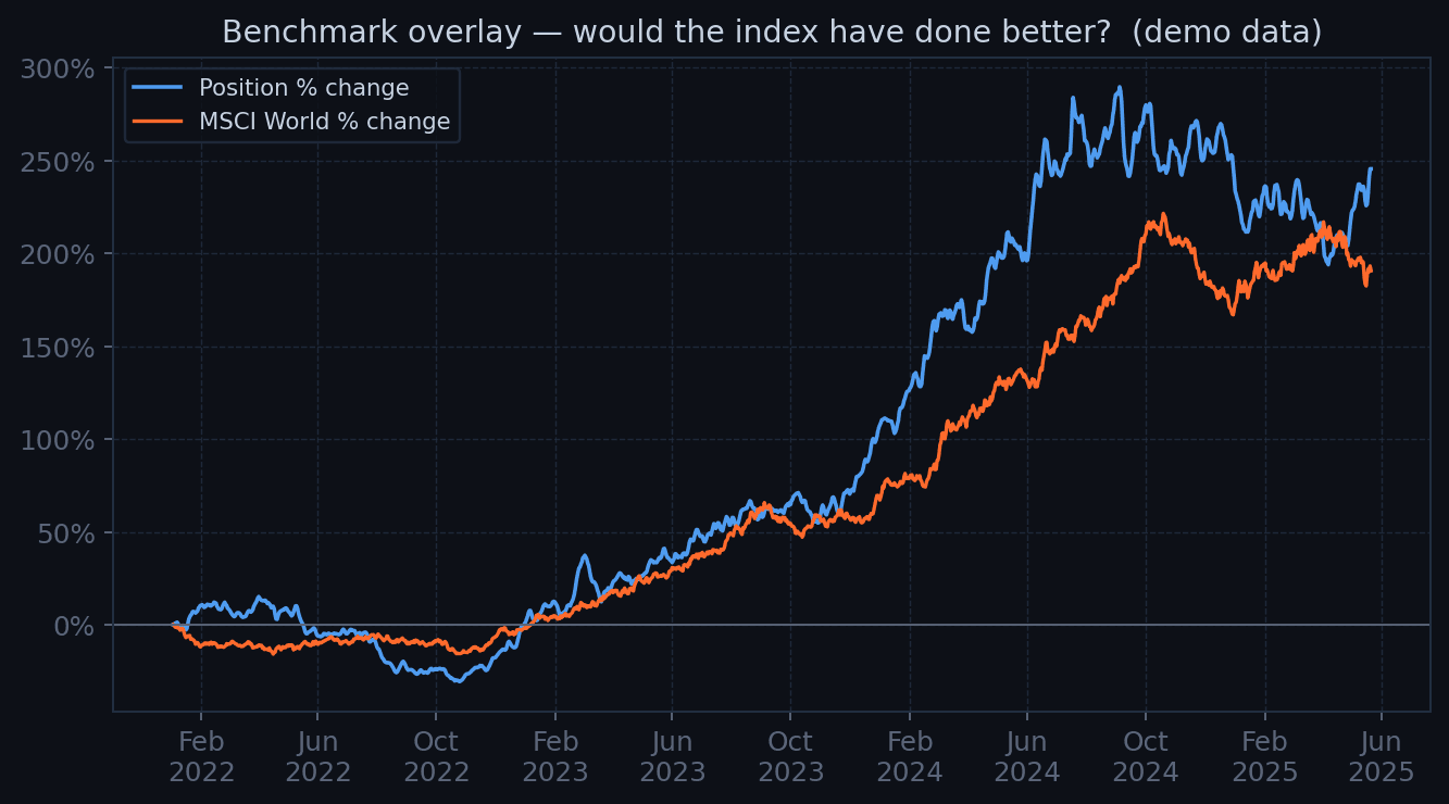
The most valuable feature in the app is a single checkbox: overlay MSCI World. Ticking it re-normalises the position to percentage change since its first purchase and draws a world index ETF over the same period on the same axis — the two lines answering, instantly and without mercy, whether the stock-picking effort beat the boring default.
Normalisation matters here: absolute prices of different instruments aren't comparable, so both series are rebased to zero at the position's start date and plotted as relative performance. The axis flips to percentage formatting automatically.
Run across a whole portfolio, this view is an ongoing, personal answer to the active-vs-passive debate — with your own money as the dataset. Some positions clear the bar; a humbling number don't; and having that fact permanently one click away genuinely changes investing behaviour.
The equity curve: value against money actually paid in
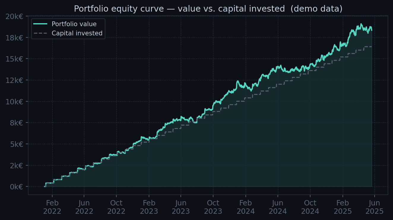
Above the single-position level sits the portfolio dashboard. Its centrepiece is the equity curve: total portfolio value over time plotted against cumulative capital invested — the honest baseline that deposits keep raising. The vertical gap between the two lines is the real, euro-denominated result of every decision made.
Because contributions distort naive return numbers, the analytics layer computes both views properly: time-weighted return (what the strategy earned, independent of deposit timing) and money-weighted return (what the investor actually experienced, XIRR over the full cash-flow history). Each position also carries its realised and unrealised P&L, split out so closed trades and open exposure don't blur together.
All of it derives from the same transaction database — no manual bookkeeping, no spreadsheet drift. Import the latest statement and every curve and figure updates.
Knowing what the portfolio is, not just what it made
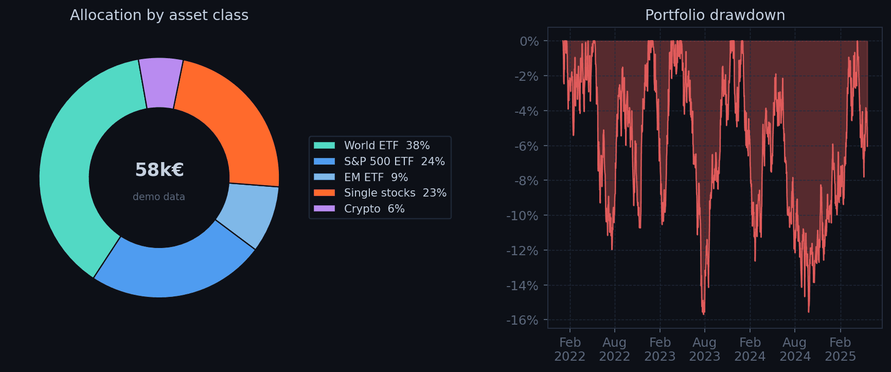
Return is half the picture. The dashboard's second half describes what is actually held and how rough the ride is: allocation donuts by asset class and by position (surfacing concentration risk the moment one bet quietly grows past its intended weight), portfolio drawdown from running peak, rolling volatility, and a Sharpe ratio over the trailing year.
The drawdown view earns its place emotionally as much as analytically: seeing that the portfolio has already survived a −16% episode — and recovered — is the best inoculation against selling into the next one. The allocation view, meanwhile, is where savings-plan drift becomes visible: monthly ETF purchases slowly rebalance the portfolio whether you're paying attention or not.
Together with the benchmark overlay, these views turn the tool from a viewer into an instrument panel: performance, risk and structure, all computed from first principles out of the same ledger.
Financial data that never leaves the machine
An architectural decision worth stating explicitly: the entire platform is local-first. The database is a file on disk, the app is a desktop process, and the only network traffic is anonymous price-history downloads for public tickers. No account credentials, no cloud sync, no third-party analytics service ever sees a transaction.
For a tool that ingests complete bank statements — balances, IBANs, every trade ever made — that's not a limitation, it's the requirement. It's also why every chart on this page shows synthetic demo data: the real instance runs on real accounts, and those stay private.
The trade-off (no phone access, no sharing) costs little for a tool whose job is deliberate, sit-down portfolio review rather than anxious pocket-checking. If anything, that friction is a feature.
The pipeline is the product
The lasting lesson mirrors professional data work: the charts took days, the data pipeline took the project. Real-world exports are hostile — encodings, locale formats, free-text descriptions that change wording between statement versions — and every robustness fix in the importer paid for itself many times over. A tool that tracks money earns trust exactly once.
The roadmap builds outward from the ledger: importers for additional brokers behind the same normalised schema, dividend and fee analytics, tax-report generation for the German capital-gains rules, and configurable alerts when allocation drifts past target bands. The foundation — clean transactions in a queryable database, prices cached alongside — is deliberately the part that was built first, because everything else is a view on top of it.
So… did I actually beat the market?
The tool exists to answer one question honestly, so it would be cowardly to end this page without asking it. I ran the study across my full transaction history since inception: total portfolio performance against a simple buy-and-hold of an MSCI World ETF over the same period, with the same cash flows. (The exact figures stay where they belong — in the local database — but the shape of the answer is worth sharing.)
Headline result: the portfolio wins. Active picks, on aggregate, beat the boring index. For about a day that felt like skill. Then came the robustness check the tool makes trivially easy: re-run the same comparison with the extreme outliers trimmed — dropping the biggest winners and the biggest losers symmetrically, so the test cuts both ways. In my case the two runaway winners were early Bitcoin exposure and a defence stock bought before the whole sector re-rated. Remove those tails, and the remaining portfolio slips slightly below the MSCI World.
That's the real finding: the outperformance isn't a repeatable edge spread across many good decisions — it's concentrated in a couple of positions that happened to explode, and the honest label for that is luck. The median pick underperforms the default. This is exactly the kind of conclusion a broker app will never volunteer and a spreadsheet makes easy to avoid computing — and it has changed how the portfolio is run since: the index core keeps growing, and single-name bets are sized as what the data says they are: lottery tickets with good stories.